Ellipses
One of the things that bothers me most about day-to-day typing is the ellipsis — a punctuation mark that is very common in legal writing. Why does it bother me? It's a matter of spacing.
Let’s start by looking at how to use ellipses. The Chicago Manual of Style effectively has two types of ellipses: within-sentence ellipses (three dots), end-of-sentence ellipses (four dots). In each case, you are supposed to put a space between each dot.
Let’s start by looking at how to use ellipses. The Chicago Manual of Style effectively has two types of ellipses: within-sentence ellipses (three dots), end-of-sentence ellipses (four dots). In each case, you are supposed to put a space between each dot.
You’ll notice that the dots in these ellipses appear to be very far apart. That’s because they are; an ellipsis shouldn't be this spaced out, but there's really no other choice. If you put three periods together with no spaces, the dots would look too close together, especially compared to the spaces on either side.
Here are a few numbers that explain the situation. In typography, one “em” (M) is equal to the point size. A standard space (at least in Times New Roman) is a quarter-em — a “four-to-em” or “M/4” space. (While real typographers have multiple sizes of spaces at their disposal, Word only has the one.)
The period glyph in Times New Roman is a dot M/8 wide with an M/16 space on each side. Thus, using periods alone creates 0.125M of space —half of a normal space — between each dot. However, putting a full space between each dot creates 0.375M — or a space and a half — between each dot. This is a lot of space, and to my eyes it's too much space.
The Ellipsis Glyph
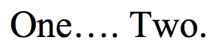
Microsoft Word, which as always tries to be helpful and fails miserably, presents an alternative solution: if you type three periods in a row, it autocorrects the three periods into a single ellipsis glyph. The ellipsis glyph tucks an additional M/24 on each side of each dot. So, you wind up with 0.208M between each dot, which feels about right, or at least closer. Here's the ellipsis glyph in the middle, compared to the "no spaces" ellipsis and the "spaced" ellipsis.
The period glyph in Times New Roman is a dot M/8 wide with an M/16 space on each side. Thus, using periods alone creates 0.125M of space —half of a normal space — between each dot. However, putting a full space between each dot creates 0.375M — or a space and a half — between each dot. This is a lot of space, and to my eyes it's too much space.
The Ellipsis Glyph
Microsoft Word, which as always tries to be helpful and fails miserably, presents an alternative solution: if you type three periods in a row, it autocorrects the three periods into a single ellipsis glyph. The ellipsis glyph tucks an additional M/24 on each side of each dot. So, you wind up with 0.208M between each dot, which feels about right, or at least closer. Here's the ellipsis glyph in the middle, compared to the "no spaces" ellipsis and the "spaced" ellipsis.
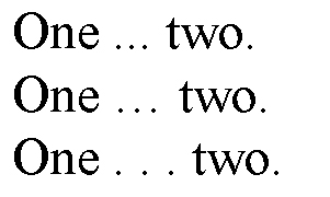
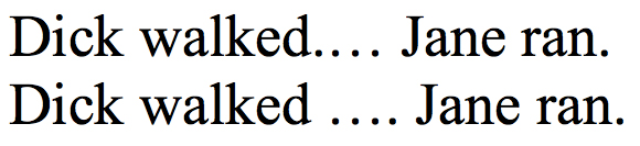
The problem occurs when you try to make a four-dot ellipsis. If you type four dots at the end of a sentence, Word will only autocorrect the first three. So, from dots 1 to 2 and 2 to 3 is 0.208M, but between dots 3 and 4 is 0.167M.
This is not a whole lot of difference. In a 12-point font, this difference is about 0.18 mm. But it's noticeable (particularly if you are a typography nerd), and it makes the punctuation feel off-balance.
If this 0.18 mm was the whole problem, I could probably live with it. Unfortunately, the problem is exacerbated by The Bluebook, the standard reference for legal writing.
Bluebooking Problems
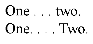
The Bluebook actually recommends two different types of 4-dot ellipses, depending on whether the omission starts at the end of a sentence or not.
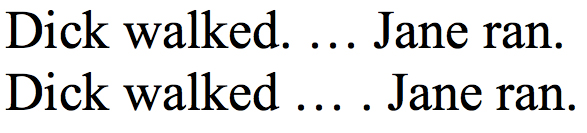
In other words, “Dick walked. At the same time, Jane ran” could become:
“Dick walked. . . . Jane ran.”
But, “Dick walked slowly. Jane ran” would be abbreviated:
“Dick walked . . . . Jane ran.”
The extra space after “walked” indicates that there was material omitted before the end of the first sentence.
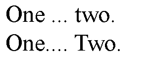
The Bluebook's recommendation, like Chicago's, is to put a full space between each dot, and unfortunately this is really the only sensible way to do it. If you use the pre-set ellipsis, you end up with constructions like this:
If this 0.18 mm was the whole problem, I could probably live with it. Unfortunately, the problem is exacerbated by The Bluebook, the standard reference for legal writing.
Bluebooking Problems
The Bluebook actually recommends two different types of 4-dot ellipses, depending on whether the omission starts at the end of a sentence or not.
In other words, “Dick walked. At the same time, Jane ran” could become:
“Dick walked. . . . Jane ran.”
But, “Dick walked slowly. Jane ran” would be abbreviated:
“Dick walked . . . . Jane ran.”
The extra space after “walked” indicates that there was material omitted before the end of the first sentence.
The Bluebook's recommendation, like Chicago's, is to put a full space between each dot, and unfortunately this is really the only sensible way to do it. If you use the pre-set ellipsis, you end up with constructions like this:
Or this:
If those don't look ugly to you, then you probably don't care enough about this subject to have read this far.
(Note: If you really care about how your ellipses look, you can always go through and manually adjust the letterspacing on each one, but this is not exactly the most efficient use of time.)
(Note: If you really care about how your ellipses look, you can always go through and manually adjust the letterspacing on each one, but this is not exactly the most efficient use of time.)
