One Space or Two?
Ah, the great one space/two space debate. I've thought about this issue quite a bit, and while I'm firmly on Team One-Space, I like to think that I'm less dogmatic about the issue that most One-Spacers.
Practice and Aesthetics
First, as a matter of typographic practice, the correct practice is to put one space after any punctuation mark. Style manuals, typographers, and even federal courts agree. You'll rarely see a published work that uses more than one space after a period. So, as a matter of formal practice, two spaces is incorrect.
However, it is worth noting that typographical choices are, in great part, aesthetic choices, and thus have no "right" answer. One-Spacers lament the "rivers" of white space that occur in two-spaced documents. Two-Spacers decry the lack of "breathing room" between sentences in one-spaced documents.
There are many claims about whether various typographical practices increase "readability" (which is in itself an amorphous concept), but if there is any real effect of one space versus two, it is a small one. If you truly think that two spaces after a period looks better than one space, then by all means use two spaces. Just be aware that a professional copyeditor will change it to one space for a published work. Also, always be open-minded. I find the "standard" settings for personal publishing —a 6.5-inch by 9-inch text block with double-line-spacing — an incredibly ugly and uncomfortable way to read. Tradition is not always a good thing.
For me, it ultimately comes down to convenience. In any sort of writing, periods are found in places other than at the end of sentences. In addition, documents are often drafted collaboratively, including copying and pasting from multiple sources. Under these circumstances, using "find/replace" to remove double-spaces is much easier than adding them in. In my view, using one spaces promotes consistency, which is an important typographic value in and of itself.
History
Historically, there was no real standard for spacing. Wikipedia has a whole entry discussing the history of sentence spacing, where you can learn about English-Spacing vs. French-Spacing, for example. An ardent two-spacer has also left this informative blog post — which shows up very high on Google's search results — with historical examples showing the use of multiple spaces after periods.
Let's Go To The Text
There is also much ado made about the difference between typewriter spacing and modern word-processor spacing, but this is also poorly understood. First, it is often said that double-spacing comes from the use of monospaced fonts on typewriters. Here is an example of Courier New, a monospaced font:
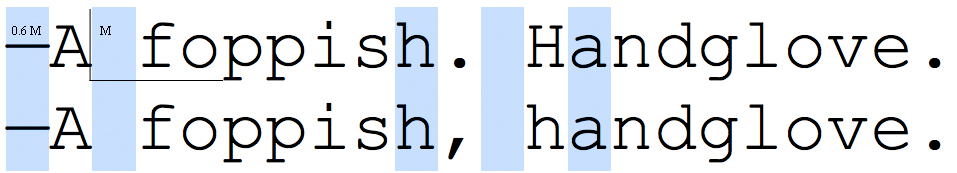
In a monospaced font, every character — including spaces — is the same width. In this case, that width is about six-tenths of an em (the point size of the font). Thus, if you use one space, the spacing after a period is exactly the same as the spacing after a comma. Theoretically, you want more space after the period, to reflect the extra "pause" at the end of a sentence. On the other hand, using two spaces in Courier makes the space look comically large, especially given how much horizontal space is already taken up by the typeface. Yet another reason to avoid Courier.
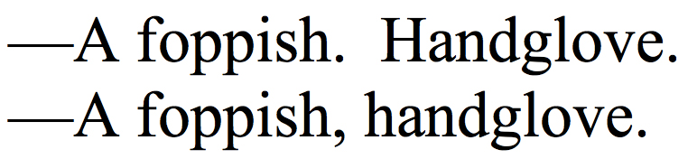
It is often said that modern proportional-width typefaces solve this problem by making the extra space "built-in." This is somewhat true, but also somewhat misleading. Consider the following example:
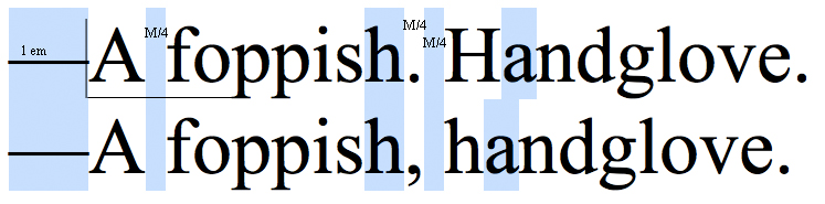
In Times New Roman, a word space is a quarter-em (M/4). The period glyph and the comma glyph are the same width (also M/4), and the space that follows each is a normal word space (M/4). Yet, the whole word following the punctuation looks shifted to the right. That is because of the capital letter. Capital letters in Times New Roman tend to be about a quarter-em wider than their minuscule counterparts. Thus, the large capital letter shifts the whole word over by the equivalent of another M/4 space. For typographers, this is enough "breathing room" to separate the sentences. Ardent Two-Spacers disagree. The Two-Spacer would prefer to see this:
To me, that looks ugly, but you can feel free to disagree.
