Point Size
The first step in learning how to type cleaner, nicer-looking documents is to understand all the little details of what you're already doing. The first stop on this journey is point size.
If you type documents in Word for a living, you probably use 12-point Times New Roman. What does that mean? One point is 1/72 of an inch. Thus, a 12-point font is 1/6 of an inch high, as measured from the lowest descender (the tails on letters such as g, j, and y) to the highest ascender (the top parts of letters such as b, d, and h).
But even this is a bit simplified. In reality, a "12-point" font is what looks good with other "12-point fonts." Here are two letters, in Times New Roman and in Courier New, both at 72-points (1 inch), with a 1-inch line next to them:
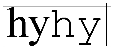
As you can see, the two fonts are not the same size, and neither one is a full inch high. "12-point" Times New Roman really takes up about 11 points of vertical space, and "12-point" Courier New really takes up about 10 point of vertical space. Nonetheless, we still call them "12-point" fonts, and that is important for how Word treats them.
